
Tips To Create a Mobile Friendly Website
13 January,16
Soon enough, there will be more mobiles than there are PCs in the world and sometimes into the future number of mobile devices will even surpass human population. If your website is not ready to face the inevitability of mobile friendly factor, now is the time to act. Here are some tips that will help you make your web design more mobile friendly.
Typography
Your typography should be optimized for mobile so that your users don’t get frustrated with all the zooming in and pinching out they have to perform and leave your website. Stick to the optimum sizes like 12px or 14px and don’t go above or beyond that.
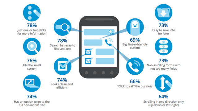
Forms
Using the miniature mobile keyboards can be quite difficult. Make it easy for your users to type into forms by providing cues. For instance, you can provide the @ symbol in the email boxes or make the site to use a keyboard with @ symbol. Similarly, you can make the site use numeric keypad for entering dates and prices.
Navigation
If your user finds himself lost in your website and has not found what he wanted to find, you are mostly to be blamed for not being helpful. Help your users navigate through your site easily by providing ‘smart search box’ and an optimized navigation menu.
Avoid using many submenus and drop down list boxes as they may not even appear on a mobile site. Always make sure your users can easily go back to the main page anytime they want by providing a home button. Have a navigation friendly web design.
Make Your Content Mobile Friendly
If you are going to add some video or an interactive content, make sure it is mobile friendly. The content should be compatible with the mobile devices and must get loaded fast enough. Use high resolution images. Try using YouTube videos on your site as these are already mobile responsive. In general, try to avoid flash and use of popups.
Test Your Site for Mobile Friendliness
Though your website may have passed all your checks, you may not be aware of certain silly mistakes that may tamper your website’s mobile friendliness. Put your website to Google’s mobile friendly test and see how it fares. This test will check for the real time expectations for mobile friendliness and show where your site lacks and how you can improve it.
Always Provide a Second Option
Remember to include the option for viewing the desktop version or going to the full website option on your mobile site. Some users might prefer it that way and hence, don’t risk losing a potential customer by denying the chance the experience the full website.
Make Use of Responsive Design
Avoid using fixed positioning and always make your elements are more fluid and flexible so that they can be viewed easily from any type of device. It is better to make use of a responsive web design than go for a separate mobile site as a separate mobile site means extra effort for SEO and maintenance.

